Cyara Rocket design system
Building Rocket, a unified design system for Cyara's product suite, from component audit through to a governed library in Figma, Storybook and Confluence.
- Client
- Cyara
- Role
- Design system lead
- Industry
- Customer experience assurance, enterprise SaaS
- Year
- 2024
- Tools
- Figma, Storybook, Chromatic, Confluence, axe
Problem statement
Cyara lacked a unified design framework. This resulted in inconsistencies in user experience, inefficiencies in design processes, and challenges in maintaining brand identity across various products and platforms.
As Cyara continued to experience rapid growth and expansion in its product suite with the sponsorship of K1 Capital, the urgency to establish a design system that can support scalability and adaptability became increasingly critical.
Objective
The primary goal was to develop a comprehensive design system for Cyara that encompasses all aspects of design and user experience. This system should standardise design elements, create coherent user interfaces, and embody the brand’s values and identity. It should also streamline the design process, enhance collaboration among teams, and ensure a consistent and delightful user experience across all Cyara products and services.
Scope
- Visual language: establish a consistent visual language including colour palettes, typography, iconography, and imagery that reflects Cyara’s brand identity.
- Component library: develop a library of reusable design components and patterns for web and mobile platforms, ensuring adaptability and scalability.
- Guidelines and standards: create detailed guidelines for design principles, usability, accessibility, and responsive design.
- Documentation and resources: provide comprehensive documentation and resources for designers, developers, and stakeholders to effectively use the design system.
- Integration and adoption: plan the integration of the design system into existing and future products, ensuring smooth adoption by design and development teams.
- Maintenance and evolution: establish a process for the ongoing maintenance and evolution of the design system to keep it relevant and effective.
Challenges
- Ensuring buy-in and collaboration across different teams within Cyara.
- Balancing standardisation with the need for flexibility and creativity in design.
- Integrating the design system with existing technologies and workflows (React, Angular, MVC).
- Training and supporting teams in adopting the new system.
Success metrics
- Increased consistency in the user experience of Cyara products.
- Reduced time and resources spent on design and development.
- Positive feedback from users and stakeholders on the usability and aesthetic of Cyara’s products.
- Efficient maintenance and iterative improvement of the design system.
Process
1. Audit existing components and decide on a library
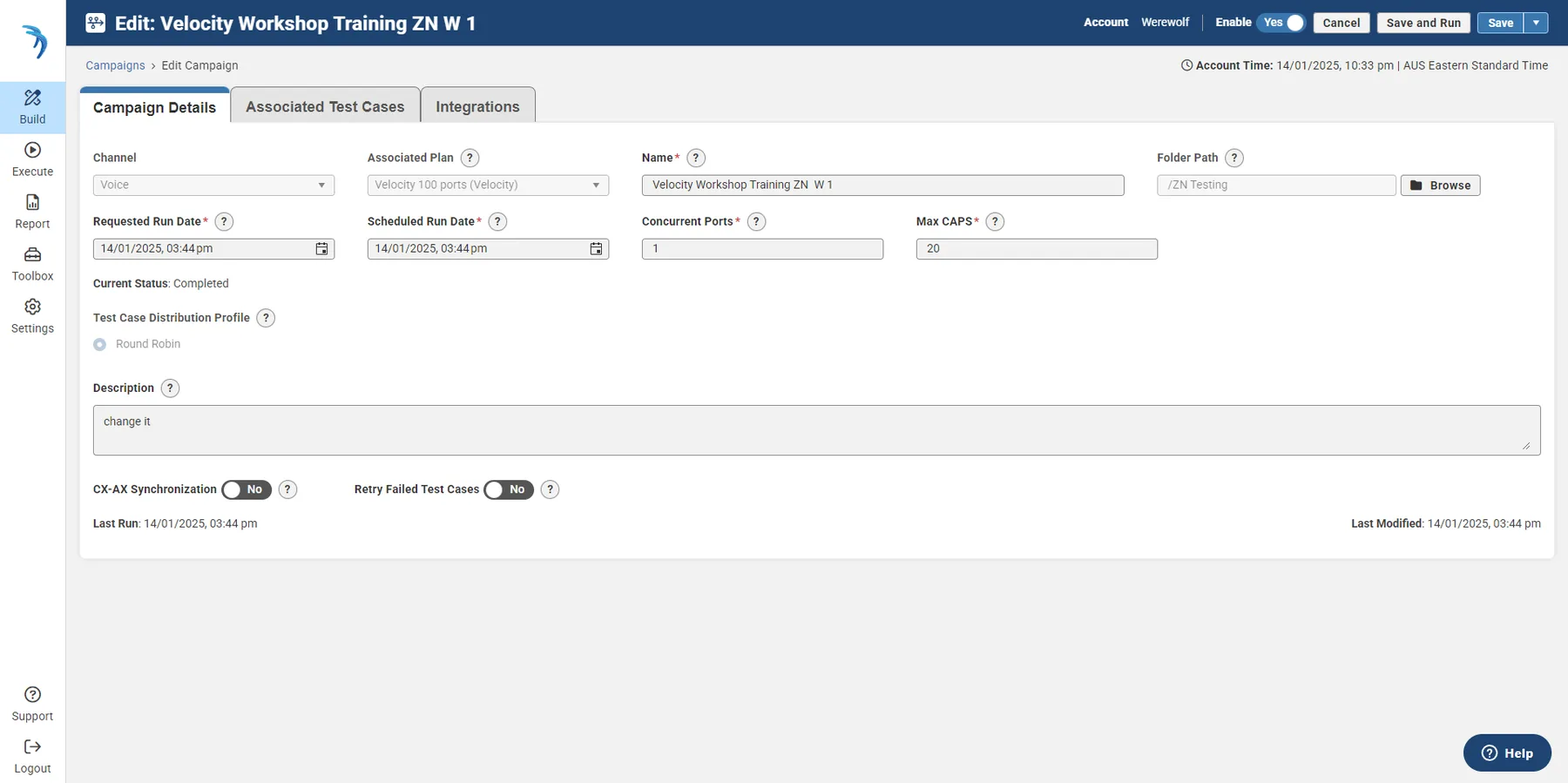
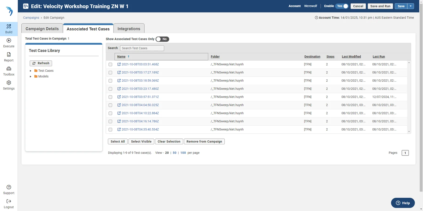
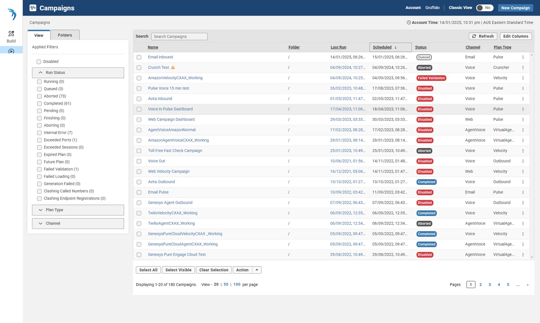
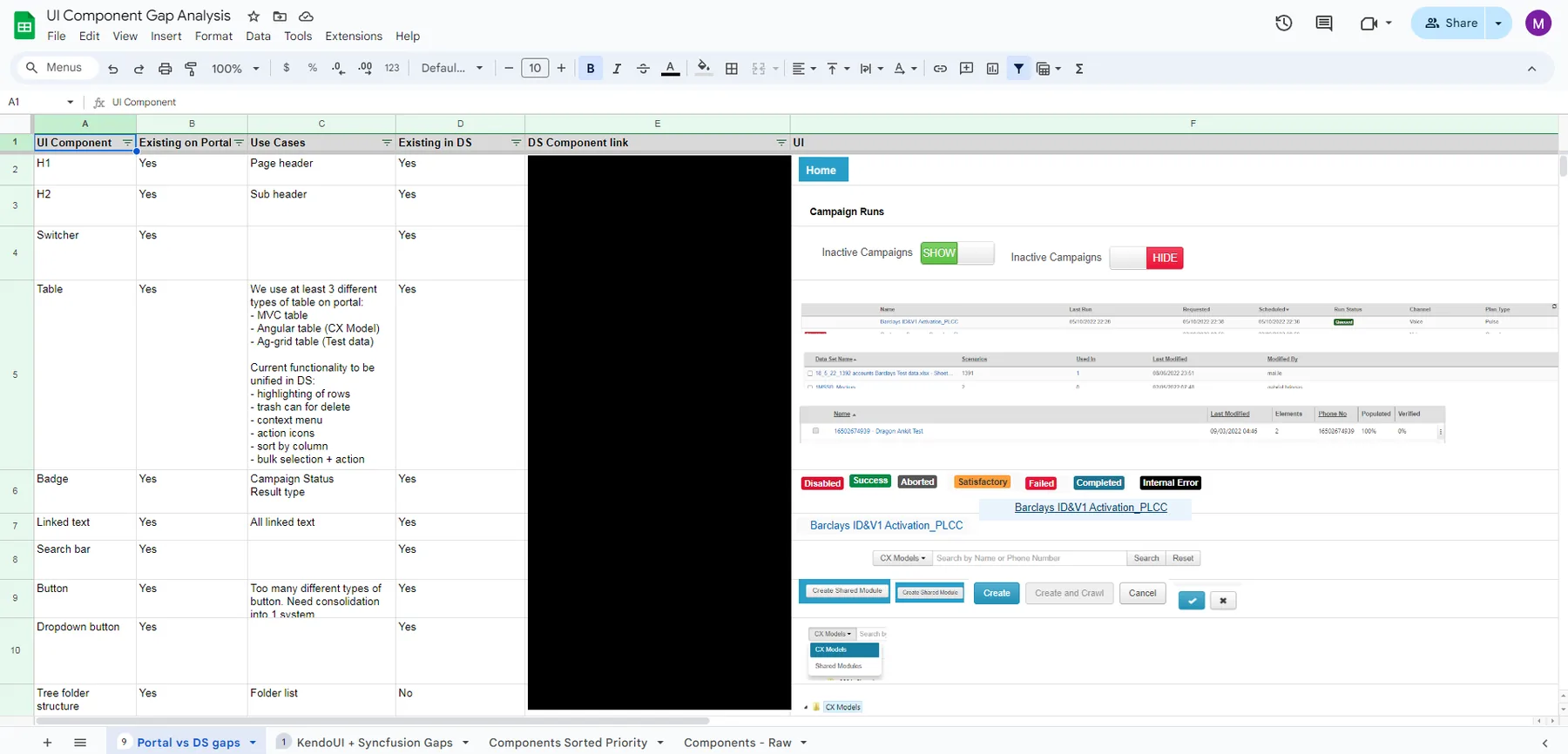
We started by reviewing all current products of the Cyara product suite to identify and catalogue all existing UI components and patterns. This included everything from buttons and input fields to larger design patterns like navigation menus. The goal was to understand which components were being reused (or not), and any inconsistencies that existed.
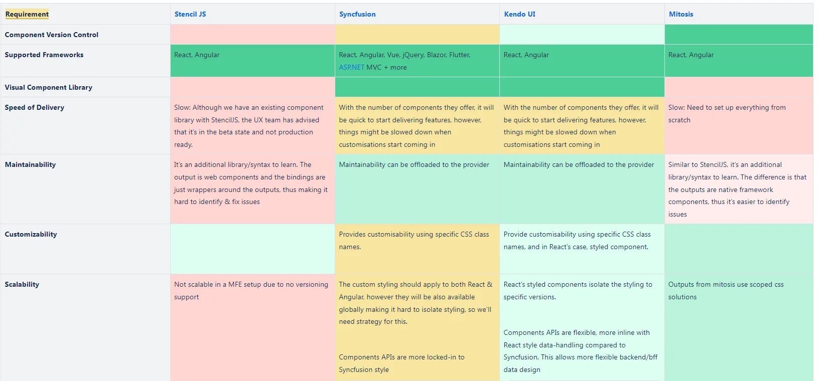
Research and discussion on which component library to base Rocket on happened in parallel, to ensure the design system could support both ongoing development projects and existing products.
2. Define design principles
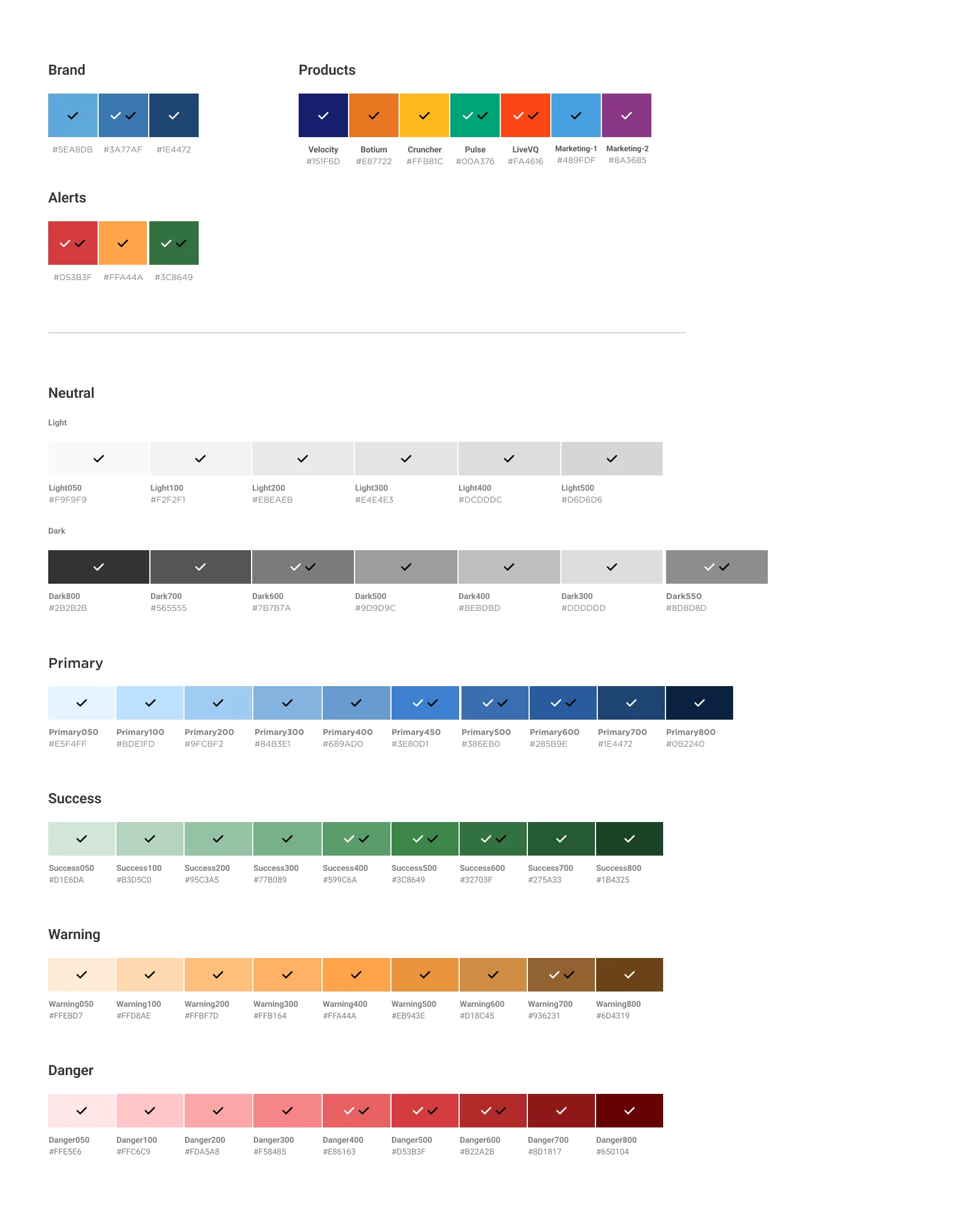
Establish a set of design principles that reflect Cyara’s brand values and the goals of Rocket, in collaboration with the Marketing team. These principles guide design decisions and help maintain consistency across the product ecosystem. This step included a colour palette investigation and proposal.
3. Establish a UI inventory
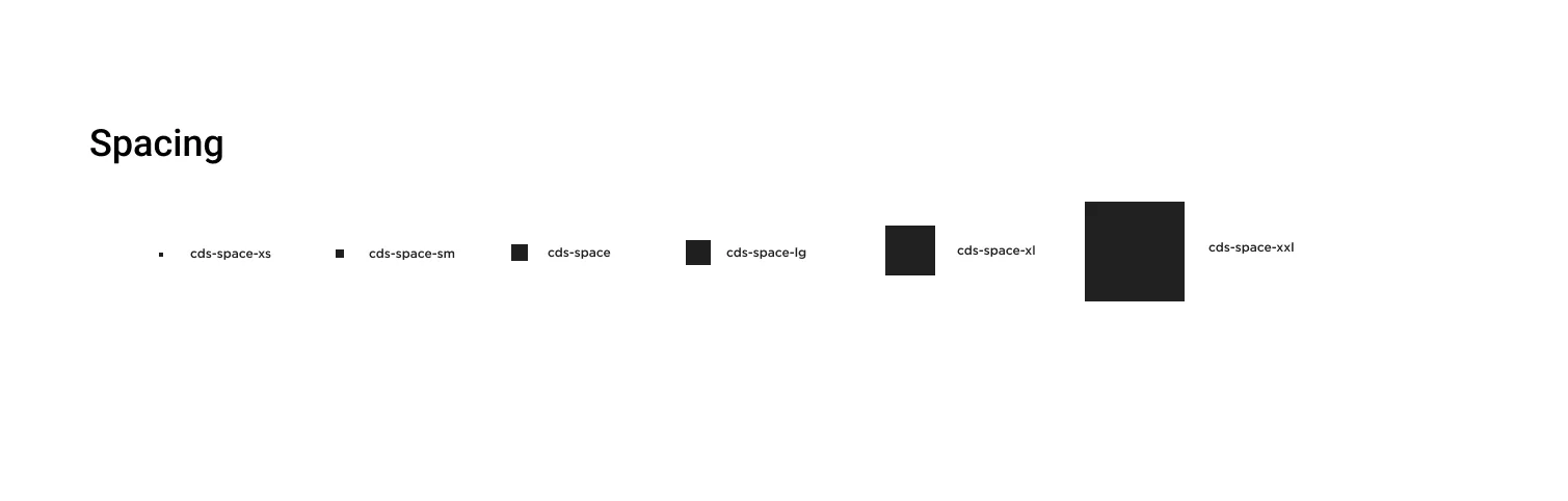
Create an inventory of all UI elements identified during the audit. This involves documenting visual properties like colours, typography, icons, and spacing. It’s essential to categorise these elements and begin defining standards for each.
4. Develop a visual language
Based on the audit and the defined design principles, the team developed a consistent visual language for Rocket. This includes detailed specifications for colours, typography, grid systems, and any other visual aspects used across Cyara products.
5. Create a component library
Develop a library of reusable components based on the UI inventory. Each component is designed for reuse and scalability, with variations and states (e.g. default, hover, active) documented. It’s crucial to ensure these components are accessible and adaptable to different contexts.
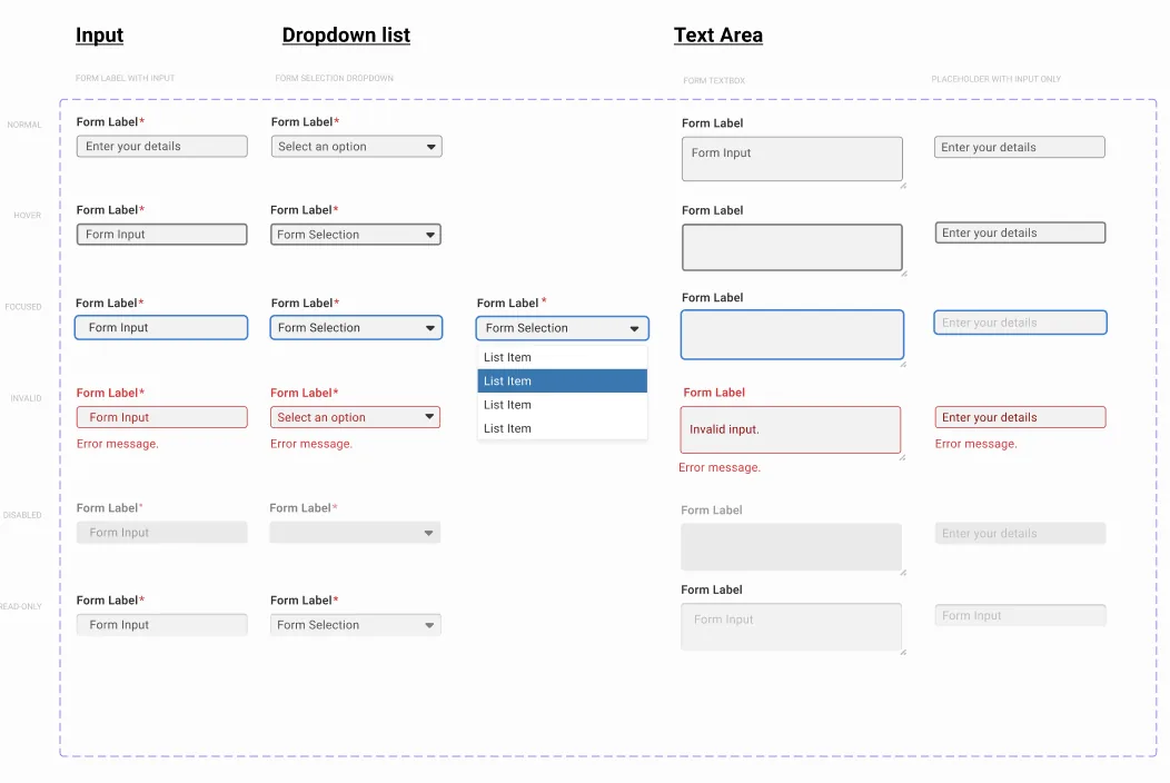
6. Usage guidelines, code standards and documentation
For each component and pattern, we wrote clear and concise usage guidelines: how and when to use a component, its variations, and any best practices associated with it.
Code standards and snippets are included in the published Storybook, so the implementation is as consistent as the design. Designers work closely with developers to create these standards and ensure components are built to spec.
Figma is used to share the design libraries, Storybook to share component libraries, and Confluence for documentation. Unit tests are written for each component, visual regression testing is in place with Chromatic, and accessibility tools are used throughout the whole cycle: axe, contrast checkers, screen readers, and manual testing.
7. Educate and evangelise
While design and development were ongoing, we introduced the design system to the rest of the organisation through workshops, documentation, and resources. Getting buy-in from designers, developers and stakeholders was important. We showed the value of the design system in streamlining the development process and maintaining a cohesive user experience.
8. Iterate and maintain
A design system is a living product; it requires regular updates, revisions, and governance. To maintain it, we established processes for the system’s evolution, including how components are added, deprecated, or updated. Gathering feedback from users and monitoring the system’s usage to inform future developments are ongoing tasks.
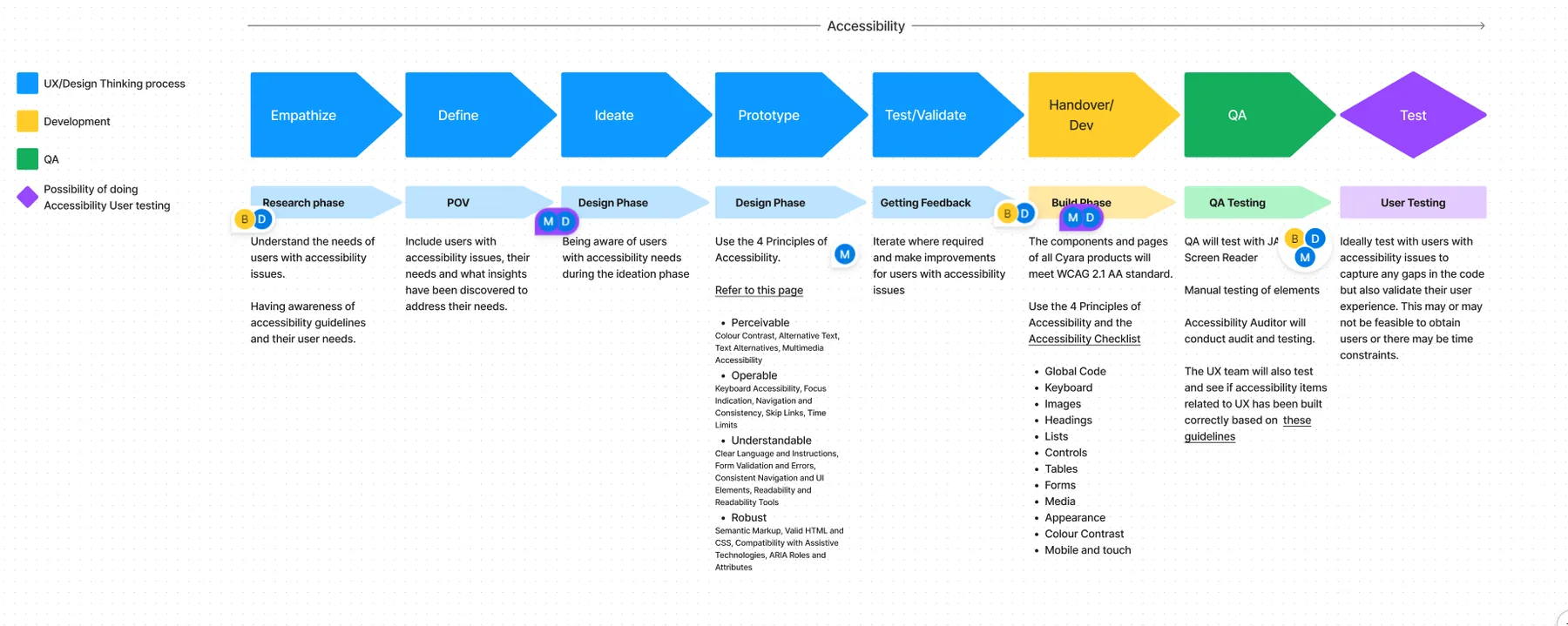
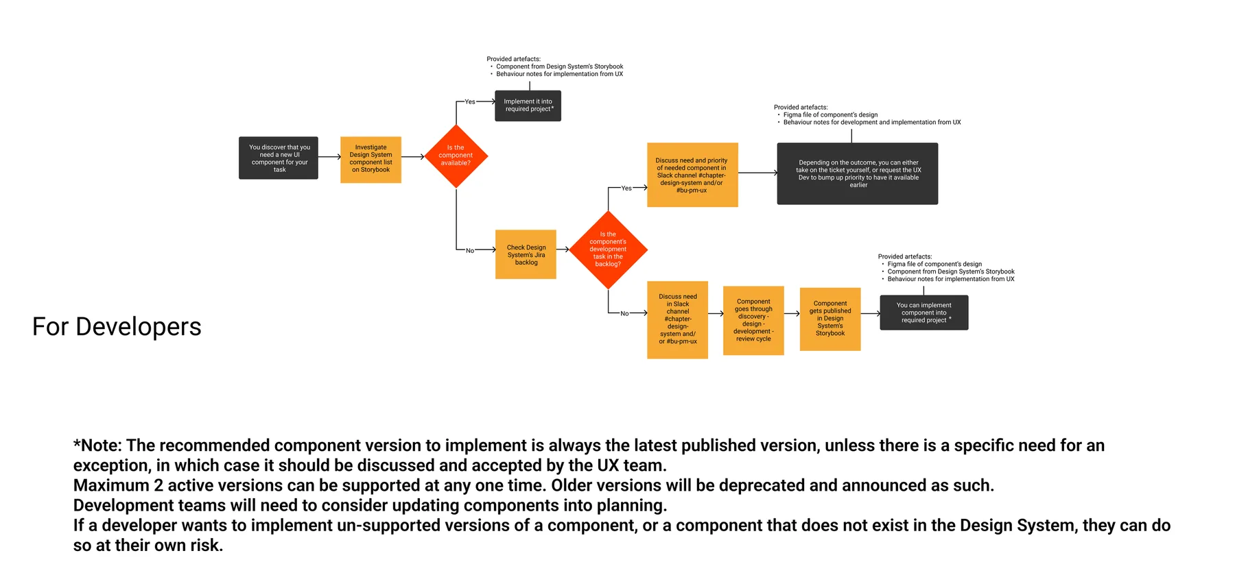
Before
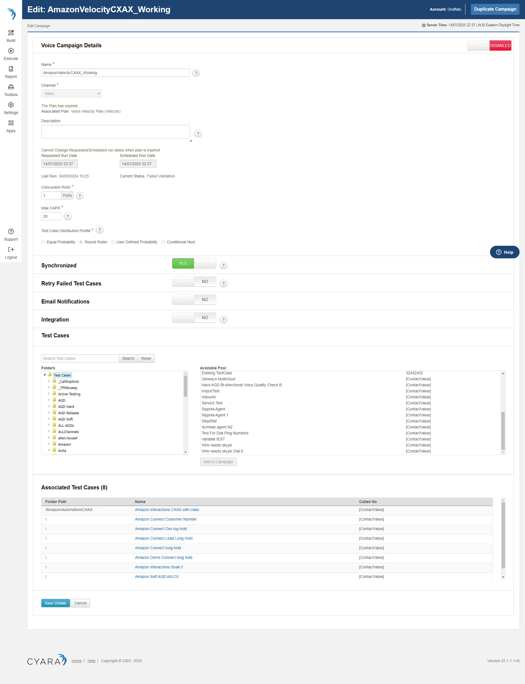
After